
menu
close
"Adam's work on The Impact Equation's brand and visual identity has been exceptional. He intuitively grasped our mission to showcase transformative leaders and translated that into a sophisticated, purposeful identity that perfectly captures our ethos. The result elevates every conversation we have and gives us confidence when approaching the calibre of leaders we want to feature. His process was collaborative and insightful throughout - he didn't just design for us, he designed with us."

With a powerful name and a meaningful purpose, The Impact Equation set out to become a podcast platform for conversations with leaders shaping a better future. But with such rich and insightful content, the brand needed a visual identity that could reflect the same depth, clarity, and ambition.
The challenge was to create a visual and verbal language that mirrored the intellectual rigour of the impactful conversations—while remaining warm, human, and inviting to a diverse audience of changemakers.
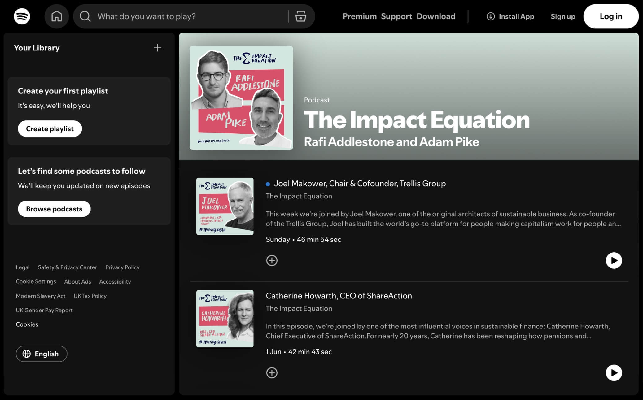
We began by identifying the brand’s dual essence: analytical yet empathetic, serious yet accessible. This duality became the foundation for the design system. We set out to build a visual identity that could hold both structure and spontaneity; blending precision with personality. Every design decision was guided by the question: How can we visually express momentum, intelligence, and the transformative nature of impact?

The final identity brings the concept of The Impact Equation to life—literally and figuratively. At its core sits a unified logo mark, pairing a custom logotype with a refined ∑ (Sigma) symbol—an instantly recognisable visual cue of insight, calculation, and progress. The visual language builds on this intellectual foundation through:


The new identity gave The Impact Equation the visual presence it needed to match the calibre of its conversations. What was once an emerging idea now has a confident, memorable brand that audiences can instantly recognise and trust. The brand now communicates its purpose with clarity and confidence across every touchpoint—from episode covers and social posts to its growing community of listeners. More than just a podcast, The Impact Equation now looks and feels like the movement it aspires to be.

